Care for You.
Simplified healthcare appointment booking, enhanced accessibility for patients.
Role
UX/UI Researcher & Designer
Year
2024
Type
Capstone Project | IIT Roorkee
Category
Healthcare Mobile App

Why This Matters
Most healthcare apps streamline the booking process. They don't fix the step before it: patients not knowing what to book or who to book with.
Care for You solved both. Built from 15 real patient interviews, it introduced symptom-to-specialist guidance upfront, reducing the full booking flow to 6 taps and under 90 seconds. Something no existing app in the space had prioritized.
Less confusion. Faster care. Designed from the ground up around how patients actually think.
The Objective
Healthcare appointment booking is broken. Patients face fragmented information, long phone queues, and no single reliable place to find, compare, and book care. This project set out to solve that, designing a mobile application that makes booking a healthcare appointment as simple as ordering a cab.
Overview
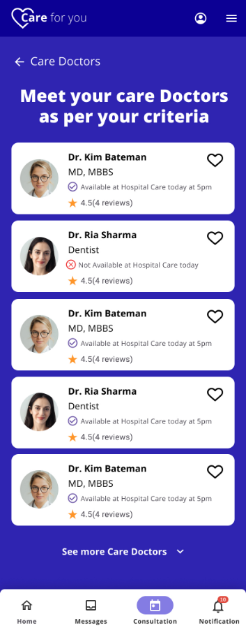
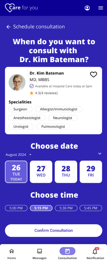
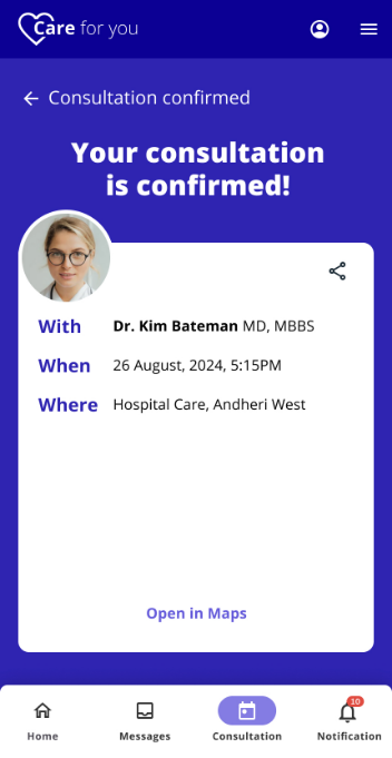
Care for You is a mobile healthcare companion that connects patients with nearby hospitals, specialists, labs, and pharmacies, all from one place. The app was designed around a single principle: the right care should take less effort to find than the wrong one. The end-to-end booking flow was refined to just 6 taps across 3 screens, reducing friction at every step.
Target Audience
Three distinct groups shaped the design from the start:
- Patients - seeking routine check-ups, specialist consultations, diagnostics, or medication refills who are frustrated by the effort required to find and book care.
- Caregivers - managing healthcare for dependents, who need a trustworthy and easy-to-navigate tool.
- Healthcare Providers - looking to reach patients more efficiently and reduce administrative overhead around appointment management.
The Problem
In India's urban healthcare landscape, patients aren't failing because they don't want care. They're failing because the system makes it unnecessarily hard to access it. Five core pain points emerged consistently across research:
- Finding available appointments is time-consuming, often leading to delayed care.
- Booking requires navigating multiple channels (calls, websites, walk-ins) with no unified experience.
- Patients lack reliable information to choose the right provider or care type.
- Missed appointments and forgotten bookings are common due to no proactive reminders.
- There is no single source of truth for hospitals, labs, and pharmacies.
The Solution
Care for You addresses each pain point directly, not with features, but with a designed experience built on clarity, confidence, and convenience.
- Streamlined booking to find and confirm an appointment in 6 taps, without phone calls or waiting queues.
- Unified provider directory covering hospitals, labs, and pharmacies in one place, with filters for location, specialty, and availability.
- Informed decision-making through rich provider profiles with ratings, specializations, insurance compatibility, and patient reviews.
- Smart reminders with proactive appointment notifications to reduce no-shows.
- Symptom-to-specialist guidance to help patients identify the right type of care before they book, reducing wasted appointments.
Design Process
The project ran over 5 weeks with a structured double-diamond approach, diverging to understand users deeply before converging on a validated, testable solution.
Phase 1: Research
Week 1
User interviews, synthesis, persona building
Phase 2: Define
Week 2
Problem framing, user flows, IA
Phase 3: Design
Weeks 3 to 4
Wireframes, UI design, prototype
Phase 4: Iterate
Week 5
Usability testing, refinements, final handoff
User Research
To ground the design in real patient experience, I conducted 1:1 interviews with 15 diverse participants including patients managing chronic conditions, caregivers booking care for family members, and working professionals who had abandoned online booking out of frustration. The mix was intentional: I needed both the emotional texture of qualitative stories and patterns I could quantify to prioritize design decisions.
What I heard:
"I don't know whether I need urgent care, emergency care, or an online visit. There are so many different options across so many websites."
- Kumari, Housewife
"I'm so confused when searching for an ENT. I see completely different results depending on whether I search 'sinus' or 'cold'."
- Naina Sharma, Retired
"I don't have time to make an appointment by phone after waiting in a queue. If only I could book online."
- Lata Rama, Professional
"How will I know if I contacted the right kind of doctor without wasting money?"
- Suman Phadke, Banker
Key Research Insights:
- 1.Confusion before booking:
Most users didn't know which type of care they needed before they began searching, creating drop-off before they even attempted to book.
- 2.Trust deficit:
Users were skeptical of results and needed social proof (ratings, reviews, known provider networks) to feel confident.
- 3.Time pressure:
Working users and caregivers needed a fast, mobile-first solution. Phone-based booking was seen as a dealbreaker.
- 4.Fragmentation fatigue:
Nearly all participants had used 3 or more sources (Google, hospital websites, referrals, phone calls) for a single booking.
👤User Persona: Mak
IT Professional, 28, Mumbai
"I want to find the care I need without wasting time I don't have."
Mak just moved to a new area and woke up with a severe ear infection. He needs to see a doctor today but doesn't know which clinic is nearby, whether they're accepting walk-ins, or how to book.
Goals
- Book without friction.
- Find a nearby, qualified doctor.
- Locate a pharmacy on the way home.
Frustrations
- No direct way to contact clinics.
- Provider information is scattered.
- Has to rely on word-of-mouth or outdated Google listings.
🧠Empathy Map
The empathy map gave structure to the emotional arc users experience, from the moment they realize they need care to the moment they (hopefully) confirm a booking.
💭 Thinks & Feels
Anxiety about choosing provider. Relief when slot is secured. Frustration at navigating unclear options.
👂 Hears
Busy signals, automated responses, conflicting advice from friends, long hold music on calls.
👁️ Sees
Overwhelming search results, long wait times, cluttered booking interfaces with no clear next step.
🗣️ Says & Does
Calls multiple clinics. Reads reviews obsessively. Gives up and asks family for help. Settles.
Design & Architecture
Information Architecture
The IA was designed around the three core tasks users needed to complete: find a provider, book an appointment, and access follow-up care (pharmacy, lab). Navigation was kept flat and task-oriented, reducing the cognitive overhead of exploring a traditional hierarchical menu system.
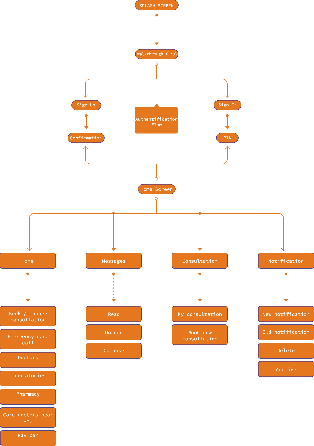
User Flow
The primary booking flow was mapped end-to-end, from app entry to confirmed appointment, with decision points designed to guide rather than overwhelm. The target: 6 taps, 3 screens, zero confusion.
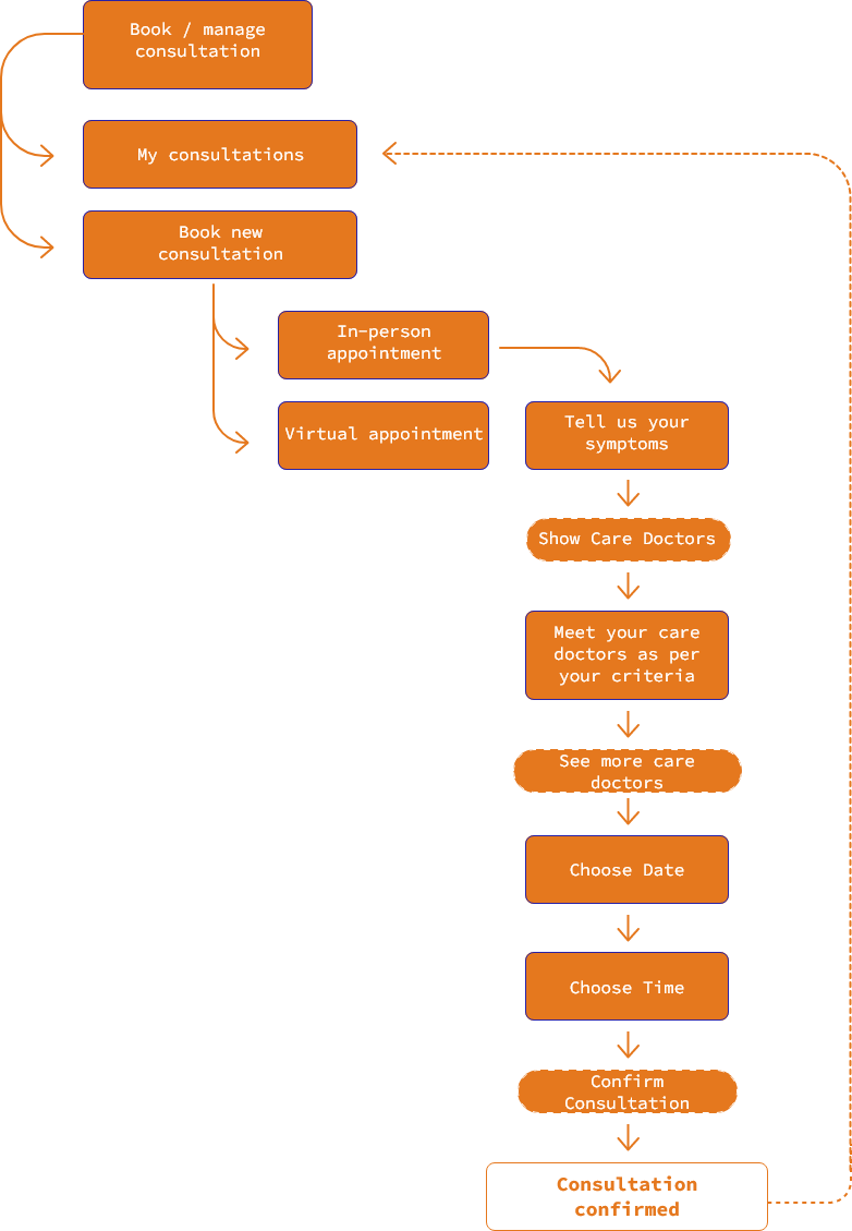
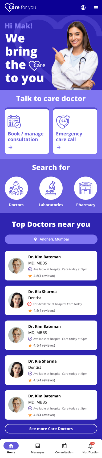
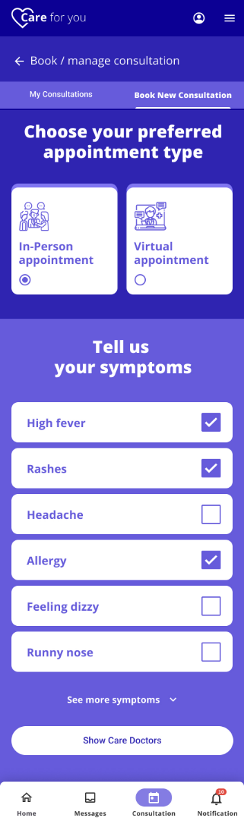
Wireframes & UI Design
Wireframes prioritized information hierarchy over visual polish, ensuring the right data (availability, distance, ratings) appeared at each decision moment without requiring users to dig for it. The UI design introduced a calm, reassuring palette and clear typographic hierarchy, reflecting the emotional context in which users access the app: often stressed, unwell, or under time pressure.
Wireframes


High-Fidelity UI Screens
Outcomes & Reflection
Usability testing revealed that participants could complete a booking in under 90 seconds, a significant improvement over the 8 to 12 minute average they reported spending across existing tools.
Key learnings to carry forward:
- 1
The symptom-to-specialist guidance feature tested extremely well but was added late in the process. It should have been a design anchor from the start.
- 2
More caregiver testing was needed. Mak's persona dominated early decisions; Anupama's use case (managing care for a family member) surfaced nuances that were underrepresented.
- 3
Integration with insurance. A future iteration should explore integration with insurance providers. The trust gap around cost was a recurring theme that wasn't fully resolved.